At the beginning of 2020, millions of social media users took part in a #TenYearChallenge which encouraged them to post one photo of themselves from ten years ago up against a photo of themselves today.
But while the #TenYearChallenge showed us how much our friends have changed, have you ever wondered how much your favorite brands have changed?
As a social media user, looking back to see how the platforms you've used every day have changed can feel fun and nostalgic. As a marketer, looking at the evolution of these platforms can also give you insight into how the overall social media industry and internet trends have matured and how they might continue to pivot in the future.
In this blog post, we're going to mark the beginning of a new decade by venturing back in time to 2010 and showing you ten-year comparisons of six of the oldest and most popular social media platforms.
While this post might be a blast from the past, it will also show you just how much the way we connect and share online has changed, and give you hints about where it might go next.
6 Social Media Platforms in 2010 vs. 2020
2010
At the dawn of the 2010s, Facebook positioned itself as the next big social media platform following the MySpace era. The network, which originally targeted college students, had already reached millions of users in young adult age groups and had just gone through a few major redesigns since it first launched in 2004.
In 2010, Facebook grew from 400 million to just over 600 million active users. During this year, the social network also gained huge attention with the October premiere of the award-winning film, The Social Network, which chronicled how co-founders Mark Zuckerberg and Eduardo Saverin launched Facebook and fought for ownership rights in an intellectual property lawsuit.
The News Feed
The Facebook News Feed was first launched in 2006. Prior to this launch, you'd simply see their profile when logging into the social network. With the addition of this page, you could suddenly see what your friends were up to all in one place.
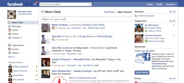
By 2010, Facebook's News Feed emphasized making connections on the platform as the left sidebar highlights friend requests and friend suggestions while the upper navigation bar included notifications, friends, and message buttons.
Here's a screenshot I dug up of the 2010 News Feed:
Source: CheeseWeaselDay.com
Statuses and Updates
While the 2010 Feed was similar to what Facebook has today, it was still pretty basic and less intuitive when it came to updating you on your friends' activities. For example, any time someone did something on the platform -- such as playing a game or RSVPing to an event -- their activity would pop up on the News Feed along with status updates.

When it came to status updates, you were limited to what you could post. The status bar merely allowed you to type in and share a quick text-only update. Once it was published, the status would show up directly next to your name. This led people to post statuses that began with the word "is." For example, in 2010, I might have written, "Pam Bump is eating burgers," or "Pam Bump is doing homework."
Likes
In 2010, the same year that The Social Network came out, Facebook also made news when it unveiled its game-changing "Like" button. Before this, you could only interact with a post by commenting on it or sharing it. The "Like" enabled you to quickly communicate with your connections even if you didn't have time to write a full comment.
While you could "Like" updates and statuses from your friends, you could also "Like" a business or fan page which would essentially enable you to follow its updates. Websites also began adding the "Like" icon to their pages, which encouraged users to click it in order to like their content or pages on Facebook.
Advertising
By 2010, Facebook Ads was still ramping up after being announced in 2007. While brands had started to make pages for marketing purposes, Facebook and Zuckerberg were hesitant about creating too many branded opportunities because they didn't want a bombardment of ads to negatively impact the user experience.
A 2007 press release described the Facebook Ads as a platform with three parts: "a way for businesses to build pages on Facebook to connect with their audiences; an ad system that facilitates the spread of brand messages virally through Facebook Social Ads™; and an interface to gather insights into people’s activity on Facebook that marketers care about."
2020
Despite all the new social media platforms that have emerged in the last decade, Facebook is still (by far) the biggest and most successful with 2.38 billion monthly active users.
Aside from the number of users Facebook's gained, it's also expanded its demographic. While the platform was originally created for college students and millennial teenagers, it's now popular among a variety of age groups.
For example, when I started using Facebook in high school, my biggest goal was to hide my profile from my parents -- who were still heavily suspicious of the internet and social media. Now, my mother texts me daily asking me why I didn't "Like" her most recent post.
I'm not the only one in my generation who's witnessed this pivot. Facebook is becoming the go-to network where parents and grandparents are connecting with family and friends. In fact, 45% of people over the age of 65 say they regularly use Facebook today -- compared to only 20% of the 65+ age group who reported using it in 2012.
So, how has Facebook's design and platform changed with its success? Here's a look at it today.
The News Feed
While the shape of the layout hasn't changed that much, the organization and type of content within it has changed drastically. Some of the more basic additions to the Feed include news ticker that highlights trending hashtags, a sleeker design, and more priority on photo and video posts.
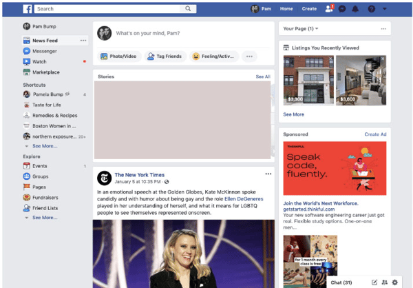
Here are a few other tweaks you might not notice about the current layout.
The Notification and Friends icons have moved to the upper navigation bar. Additionally, events have been moved to the side navigation. This simplifies the pages of the site allowing users to focus on the Feed, interesting posts, and other important centrally-located items.
Behind the scenes, Facebook has also continued to tweak News Feed algorithms with the aim of showing users content that they're actually interested in. For example, you now see more statuses, content, and other types of content due to the interests you've shown on the platform. Whereas, in Facebook's early years, you might have just seen an endless stream of your friends' high scores on the online game Candy Crush.
Additionally, although Facebook now offers a wider variety of marketing and advertising options for brands, its Feed now algorithmically prioritizes content from individual users before posting content from brands.
Statuses and Updates
Instead of the old status bar that would prompt users with text a simple text box, there's now a text box at the top of the feed that more broadly asks "What's on your mind." At the bottom of the text box, you can now also see icons for "Photo/Video," "Tag Friends," and "Feelings/Activities."

So, if you're on vacation with family and friends, you can post a status that includes images of where you are, captions, a "happy" feelings icon, a geo-tag to show where you want, and tags of all the friends who were with you so their networks can see and react to the photos.
This shift makes the News Feed feel much more interesting, visual, and personal for users -- which might allow them to surf through its content for a longer amount of time.
Likes and Reactions
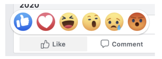
After the success of the "Like," Facebook launched additional "Reactions" such as a heart, a laughing emoji, a sad face, an angry face in 2016. These tiny tweaks have allowed users to interact with content in a more emotional and personalized way, even if they don't have time to draft a full comment.
New Features and Platform Extensions
Aside from making the News Feed feel more personalized, Facebook, which is now a major social media corporation has also taken steps to expand its original platform and its ownership of other key social networks.
To start, Facebook re-launched its direct messaging system as the standalone Facebook Messenger app in 2011. On the desktop site, Facebook also made its Messenger tool accessible on every page of the site.
Later, in 2014, Facebook also acquired another popular messenger called WhatsApp. Although WhatsApp wasn't generating much revenue at the time, Facebook and founder Mark Zuckerberg acquired the international messaging app because they saw it as an opportunity to reach global audiences that weren't on Facebook yet, but still wanted to communicate and make connections online.
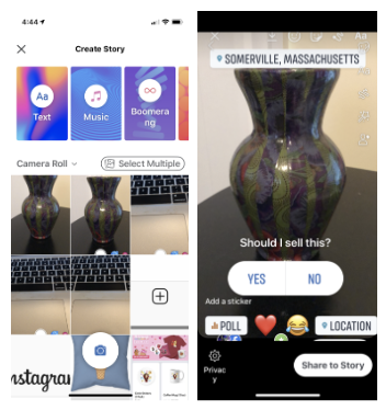
Most recently, in 2017, Facebook launched a Stories bar to its News Feed, following suit of Instagram Stories. This came shortly before Facebook purchased Instagram, in order to mature the Facebook Stories feature while tapping into Instagram's millennial and Gen Z audiences.
Advertising
Facebook Ads is now a robust and incredibly popular advertising platform, in fact, marketers now spend most of their marketing budgets on Facebook Ads, along with Google and Amazon ads.
While the early Facebook Ads allowed basic audience targeting and page analytics, the platform now offers more intuitive versions of these features. It also allows you to launch ads around a handful of objectives, including website traffic or ecommerce purchases.
For companies that just wish to use a Business Page, Facebook has also improved features related to this, such as Facebook Insights which shows you how your page is performing against potential competitors.
In addition to ads on its platform, Facebook has also improved advertising options on platforms like Instagram and WhatsApp. To learn more about changes related to Instagram, keep reading.
2010
Instagram was launched in 2010 as a social media app for photo-sharing. By 2012, the simple social media app was already seeing over 100,000 app downloads per day.
Layout
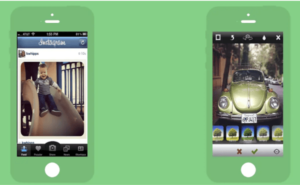
In the app's infancy, it had a simple layout with a basic photo feed. Similarly to Instagram's current feed, it showed a user's name, then a photo, then the photo's likes, and a description.
The below photo shows what Instagram's main feed and camera looked like in 2010.
Source: Business Insider
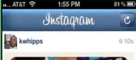
However, while there were some similarities between the original and current layout, there were a number of crucial differences. For example, the app's logo was a completely different font and took up the entire top of the feed's page. Here's a quick comparison of the logo then and today:
Original Logo Banner:
Current Logo Banner:

Additionally, the lower navigation options were also much larger and organized in a slightly different way than they are today.
Old Navigation

Current Navigation

Features
Aside from the design, Instagram had very basic features. It was primarily meant for posting square photos or short videos on a feed that your followers could see. To learn about other Instagram accounts, you could either search a person or hashtag, tap the Popular feed to see posts from influencers, or you could surf through a Newsfeed that showed posts from major companies and publications.
2020
Layout
Similarly to Facebook, the Instagram Feed's core design is similar, but much sleeker, more intuitive, powered by better algorithms, and additionally has an Instagram Stories bar. It's camera also still looks similar but has a cleaner, white design.
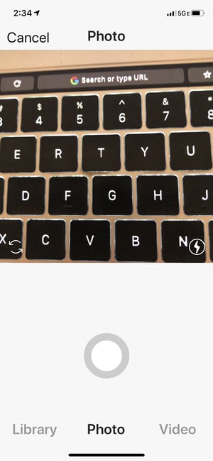
Within the last decade, Instagram has made its design look less busy by opting for a white background. It has also replaced the giant upper logo banner with a smaller logo and a navigation bar which includes a camera icon for Instagram Story recording, a TV icon which will bring you to IGTV, and a paper airplane icon for your direct message inbox.
Instagram has also adjusted its lower navigation, swapping out a Popular post feed with a more robust Search Tab which consolidated the Search bar and popular trending posts. With this adjustment, a user hoping to discover new accounts or content only has to go to one tab of the app.
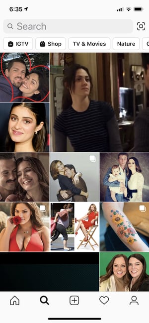
Once consolidating the News tab into the Search tab, Instagram added a heart icon in the News Tab's place. This tab now houses a user's notifications.
When it comes to the camera, Instagram now allows video and photo recording, while still enabling the user to upload content from their library.
Features
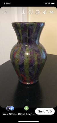
Aside from the standard Instagram camera, there's also a special camera for recording Instagram Stories, a game-changing feature launched by the platform in 2016.
By now, you've probably created or seen an Instagram Story. But, in case you haven't, this feature allows you to film or upload images or video that tells a story about your life or your brand. If you have a verified business account or more than 10,000 followers, you can also link Instagram Stories to your website's content.
When creating an Instagram Story, the app's camera allows you to take vertical, smartphone-shaped shots or videos. Then, you can use its featured icons to zest up your content with text, sounds, GIF stickers, or color-overlay filters. You can also use a variety of video filters and AR features to zest up your content.
IGTV
Instagram's current app also includes IGTV, launched in 2018. Currently, you can see IGTV content related to your interests by going to the Search tab and tapping the IGTV button.
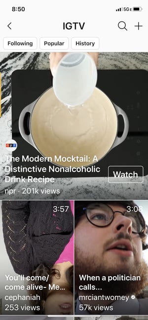
With this feature, brands and influencers can upload or stream longer-form live content in vertical format. This content can then be highlighted on their accounts under an IGTV tab.
Shoppable Posts
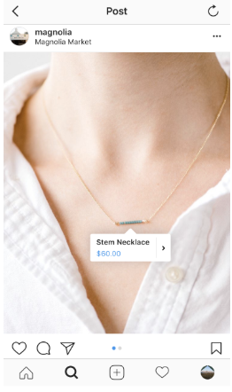
After Instagram was purchased by Facebook, the app added a new feature that could be utilized by brands with a Facebook Marketplace catalog. The feature, called Shoppable Posts, allows brands to tag posts with product shots with a link to the product listing in their Facebook Marketplace.
Unlike Instagram Story swipe-up links, the Shoppable feature can be accessed by any Instagram Business account linked to a Facebook Marketplace catalog -- regardless of the business accounts following.
Here's an example of what a Shoppable post looks like on the platform:
2010
When Pinterest launched in 2010, the platform's purpose was simple. It allowed you to save and store links to websites that you thought were interesting.
It was a place where you could save and present a "collection" of web content that you wanted to share with people similar to you. To keep your link collections organized, you could categorize them by creating a Pinterest board around an overarching topic.
Layout
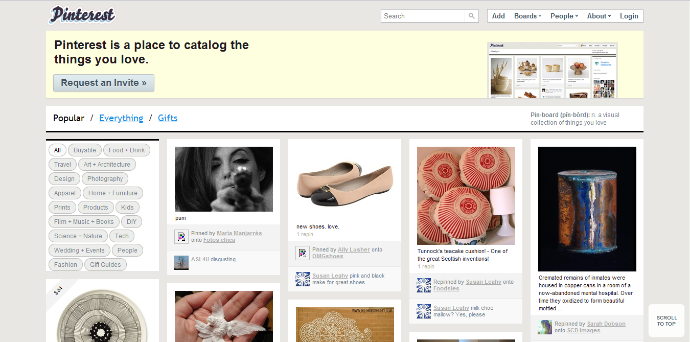
Since it had a much more basic purpose, the original Pinterest website looked more like a very basic, photo-based blog. You could still add photos, tag posts with specific topics, and create inspiration-styled boards around specific categories, but the design was much busier and not mobile-optimized.
Source: Beebom
When the platform first launched, you also had to "Request an invite" to join since it was still in its beta phase. In fact, the platform was still invite-only through 2012, when Mashable described it as the year's "hottest" social media platform and noted that it generated more referral traffic than YouTube, Google+, or LinkedIn.
2020
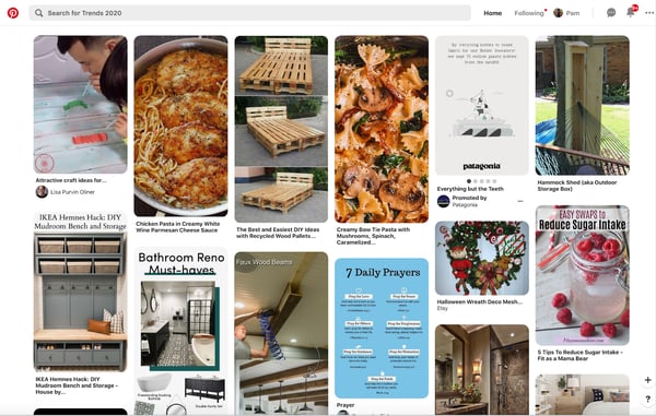
The current Pinterest design, and its mobile app, now emphasizes visuals even more than its first design. Because of its visual inspiration board aesthetic, Pinterest has also continued to position itself as a site people visit to find inspiration related to products, home designs, or even life experiences such as travel.
Layout
The platform is also more compact and mobile-optimized as the social media network's logo has been minimized and the search bar has become a more natural fit into the upper navigation. Unlike the old design, you can also see notifications when someone shares or engages with one of your posts -- also called pins.
Visual Search Features
Aside from the text-based search, which you could take advantage of in the original design, you can now also search for pins with a reverse photo search feature. For example, if you see a product you like in real life, you can take a photo of it and search for similar items.
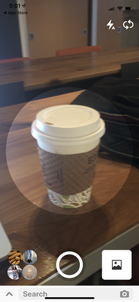
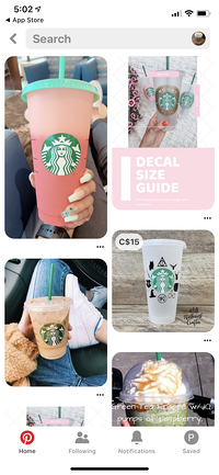
The visual search feature seems like a low-hanging fruit for Pinterest which is a highly visual platform. Aside from allowing people to find products or images they're interested in, it also might attract visitors who are interested in discovering information related products or images, rather than spending time creating inspiration-themed boards.
Advertising and Brand Awareness Features
With brands like Target already using Pinterest boards to highlight product lines, the platform has become a natural fit for advertisements. Currently, the Pinterest Ads Manager, launched in 2014, allows you to create PPC ads with its own audience retargeting and A/B testing tools.
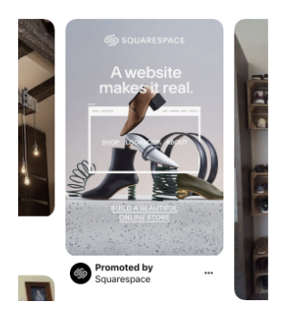
To accompany the Pinterest Ads Manager, the platform also recently launched an Audience Insights tool in 2018. This feature gives businesses more data and analytical information about their audiences and how their content is performing.
At an event covered by Digiday, Pinterest's Head of Agency Partners, Yolanda Lam, explained, “Agencies and clients know we have unique insights, but they don’t have easy access to it. … They need to call a salesperson to understand what is available. Now, you can go in there to pull those data sets.”
To learn more about how to create and test effective Pinterest ads, check out this blog post with tips from a PPC expert.
Twitter was founded in 2006 with a similar positioning as today. It was a social network where you could fire off short thoughts about trends, topics, or events that were important to you. These thoughts came in the form of text-based tweets under 160 characters.
After being presented at SXSW in 2007, Twitter saw its first surge in traffic as it moved from 20,000 to 60,000 users during the event. Also that year, Dell became the first major corporation to join the social media platform, while Twitter was incorporated as a company.
After rolling out a number of simple features including follows, replies, and hashtags in 2007 and 2008, Twitter launched its first major redesign in 2010.
2010
Layout
Although the brand and platform's mission hasn't changed at its core, the layout has certainly come a very long way. Despite being considered one of the hippest social media platforms of its time and pioneering the trending hashtag, its initial 2010 design was actually quite clunky and visually busy.
The Twitter layout split the main homepage in half. On one side, you could find a Timeline that was similar to today's Twitter feed. On the other, you could see details about how many tweets you'd sent, follower suggestions, your follower counts, and a long list of trending hashtags.
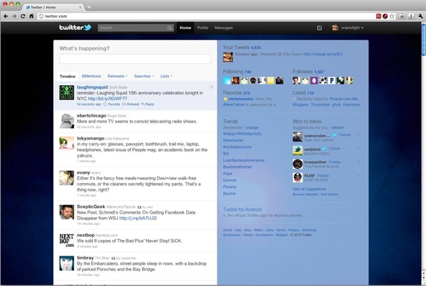
Source; Wired
Aside from seeing a Twitter feed on one side of the page and your own tweets on the left, you could also click on tabs like @Mentions to see when you'd been tagged in tweets from others, retweets to see when others retweeted you, or searches to see your past searches.
Like today's Twitter platform, you could also add accounts you followed to specific "Lists" and then see their tweets by clicking on the "Lists" tab.
2020
In 2020, Twitter's main page is a lot easier to navigate. While the feed is placed directly in the center, you can still access its key features, like Lists, and your profile by clicking on clearly marked buttons in the left navigation bar. The website still also prioritizes trends by dedicating the right sidebar to viral topics and hashtags and a "Who to Follow" box.
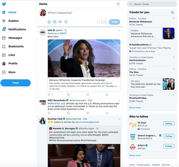
Similarly to the other social platforms on this list, the Twitter feed now emphasizes photos and videos more than it did in 2010.
Aside from the visual changes to the main homepage feed, Twitter has also become more personalized to each user. When you discover, follow, and engage with content or accounts through Twitter's feed, Explore feature, and Twitter Topics, Twitter's algorithms take that data into account when prioritizing content that you might enjoy on your feed.
A recent blog post about Twitter Topics highlighted Twitter's mission to make feeds and content more personalized to users:
"Previously, all of the work was on you to figure out the best way to keep up with what’s happening by following certain accounts, searching for it, or looking in the Explore tab for the latest. Now, you have the option of seeing the most relevant and interesting Tweets about what you care about with a single tap, and the conversation will come to you."
Reddit was launched as a discussion-oriented social media network in 2005. However, it didn't become a viral success overnight. In fact, to make the platform look like it was more popular, thousands of early posts were published by fake accounts created by the Reddit team.
“The first thing it did was it set the tone,” Co-Founder Steve Huffman revealed in a VentureBeat post. “We were submitting content that we would have been interested in seeing. That meant the content on Reddit … was good. And when you show up, you know exactly what the site is about.”
Despite Reddit's early, and controversial, fake account strategy, the platform eventually did become popular. In its first two years, discussion communities -- called subreddits -- began to gain popularity. By 2007, some of the most popular subreddits were "NSFW" -- which stands for "Not Suited for Work" "Programming," and "Science."
2010
Just before 2010, Reddit moved its website to Amazon Web Services servers which tripled its traffic. By 2010, the platform's founders claimed that they were seeing roughly 8 million visitors per month.
Layout
Despite its unique discussion-oriented platform and growing popularity, Reddit's 2010 platform was pretty basic. The layout was primarily text-based as it encouraged users to discuss topics in subreddits, which were similar to public chat rooms.
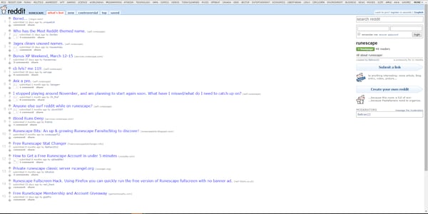
Source: Reddit
Aside from the main feed that you'd see when logging on to Reddit, you could look at the very top of the page to see trending subreddits. When you were on a subreddit, you could toggle between tabs including, "what's hot," "new," "controversial," "top," or "saved" to see different types of posts within the subreddit.
On the right of any Reddit screen, you could also see a box that would allow you to post your own links or text to a subreddit.
Similarly to today's Reddit format, you could also "Upvote" posts you enjoyed to help them show up higher on Reddit feeds or "downvote" posts to lower them. If you wanted to participate in a conversation, you could simply reply to a post.
2020
Although Reddit's formatting has changed a lot, it's audiences are still interested in similar things. Although the most popular subreddits have evolved to more specific topics, such as "emerging technology," many of them still loosely relate to the platform's earliest most-popular topics of "science" and "programming."
Layout
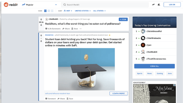
Reddit's current platform now emphasizes a lot more visuals as it includes a Trending stories tab at the top with photos related to each topic, and more capabilities allowing users to upload high-quality photos and videos.
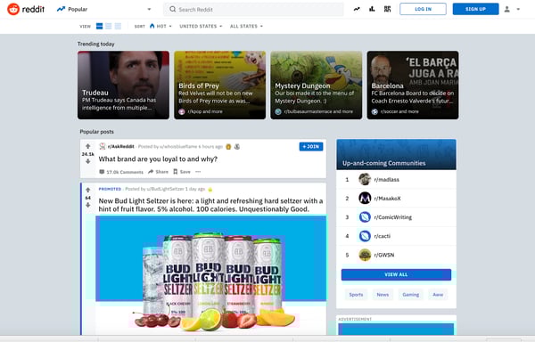
Reddit, which now has 430 million monthly active users, also recently launched a streaming feature that allows users to interact with others while on live video.
Aside from its streaming feature, Reddit has also added more advertising options, including native ad blocks in its right sidebar and promotional posts which are located higher in related subreddit feeds. This is part of a play to make Reddit more appealing to brands and marketers.
LinkedIn launched in 2003 as a members-only networking platform that you had to subscribe to with a membership fee. By 2011, the network was free and had become the first and most popular professional social media network. That year, the company drastically increased its funding and brand awareness with an IPO.
But, at this point, the website's platform looked suspiciously nascent.
Shortly after its IPO, I had my first experience with LinkedIn as a college sophomore. I suddenly started receiving plain-looking emails saying that my email contacts invited me to a networking site called LinkedIn. After ignoring these emails thinking they were spam, I started hearing more about this site and decided to visit it. When I did, the site looked as basic as the emails I received.
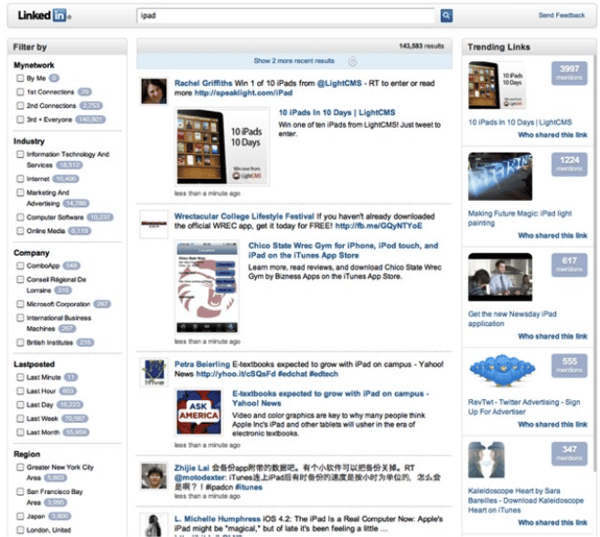
Here's what it looked like:
Source: TechCrunch
The original design centered around a search bar and search results feed which you could use to learn about topics in your industry. To help you sift through your search results, the homepage also had a sidebar that offered an expansive list. Aside from the feed and filters, there was also a right sidebar showing off "Trending Content' related to your searches..
2020
Ten years later, LinkedIn's become an online networking necessity with a much more intuitive layout. Not only have I found amazing jobs on this social network, but I now use it almost daily. In fact, my optimized LinkedIn profile even led my HubSpot manager to find and reach out to me for an interview.
I'm not the only one who's found career success with this social networking tool. A recent study found that over 122 million people have received an interview through the social network. It's also become a vital tool for companies as it hosts over 20 million job listings.
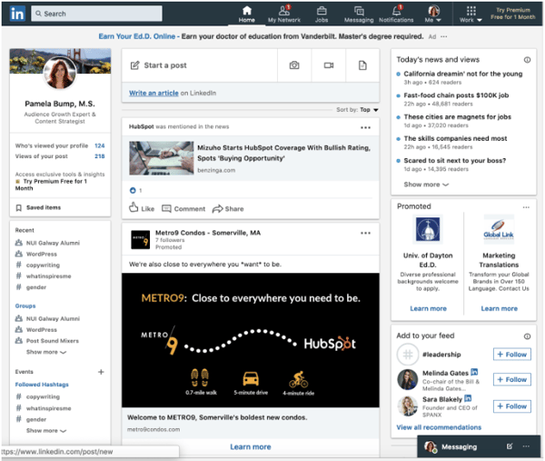
With over 660 million users, LinkedIn has followed the similar theme of other platforms on this list by emphasizing more photos and video-based content. It also has continued to embrace trending topics in its right navigation bar, similarly to Twitter and Facebook.
LinkedIn has also adjusted its design to be more social-media friendly by adding a navigation bar with a Friends and Notifications tab.
Additionally, today's layout includes a messaging feature which is crucial for both social and professional networking. This feature is easily accessible in the upper navigation bar and in a lower box at the bottom of the page.
What Marketers Can Learn from Social Media's Evolution
As you've seen, all of these platforms have evolved to become more visual and personalized to users. This represents how social media audiences are interested in interacting with friends, viewing fast-paced feeds with valuable information, and consuming highly visual video or photo-based content.
If your marketing strategy hasn't evolved to fit these strategies yet, you should be working towards tactics that allow you to better connect and communicate with your audience on these platforms. You should also begin to put an emphasis on the creation of shareable multimedia content such as informative blog posts with photos, marketing graphics, or high-quality video content.
To learn more about how you can leverage major social media platforms, check out this detailed guide on the five types of social media and the pros and cons of each.
No comments:
Post a Comment