When you're first starting a business, branding is likely the last thing on your mind. After all, it's hard to sit down and flip through fonts when you're still trying to figure out who your customers are (and where to find them).
Plus, even if you made creating a brand identity a priority in the beginning, a change in business plans might have made your initial branding strategy obsolete.
Whether your branding design efforts started (and ended) with a logo jotted down on a napkin, or you whiteboarded your way through the complete branding process -- from brand values to logo variations -- somewhere along the way things stopped working.
However you got here, you're not happy.
Fortunately, rebranding is not uncommon -- many major brands, ranging from Dunkin' Donuts to Uber, have successfully rebranded in the past.
If you're considering a rebrand, keep reading to learn how to rebrand a company, plus examples of other brands who've successfully rebranded their website, name, logo, or entire company mission and purpose.
But first, let's make sure you have the right reasons to rebrand.
The Right (and Wrong) Reasons to Rebrand
Rebrands are complicated, and carry big risks.
Even big brands aren't immune -- just look at Uber. After redesigning its logo, 44% of people were unsure of what Uber's logo represented.
Ultimately, knowing the risks of rebranding can help you determine whether or not you're going into a rebrand for the right reasons.
If you're looking at rebranding your business because sales have been slow or brand awareness efforts don't seem to be paying off, you might want to reconsider -- these issues can potentially be solved by creating a new marketing strategy, or conducting market research to identify the underlying cause.
But if you're considering a rebrand because your company's vision, mission, values, and market are no longer reflected in your brand, then a rebrand might be the right decision.
There are a few other major reasons you might consider a rebrand, including:
- New locations -- you might need to refresh your brand if you're expanding to international markets who won't identify with your current logo, messaging, etc.
- Market repositioning -- brands are designed to connect companies with their customers, so if you reposition your business to target a completely new customer profile -- whether through product, place, price, or promotion -- your brand will need to follow suit.
- New philosophy -- your business’s mission, vision, and values should govern every decision you make -- including brand decisions. If your MVV are shifting and pivoting the direction of your business along with them, you’ll need to reevaluate your brand.
- Mergers and acquisitions -- when two companies come together, two brands come together, as well. If your company was acquired or joined with another company, you can’t just let both brands battle it out. Finding a new brand that reflects the new entity will prevent confusion and build trust.
Additionally, here are a few reasons not to rebrand:
- Boredom -- too often, people consider a rebrand because they're sick of seeing the same logo and slogan every day. When you’re starting to feel restless with your brand, remember that your customers (who see it much less frequently) might love that signature color you've come to loathe.
- Covering Up a Crisis -- whether you're working against persistent internal issues or fending off bad press, a rebrand isn't the answer. Most consumers and employees are smart enough to see right through your rebrand and recognize it for what it is -- a cover-up.
- Impact and ego -- for new managers, a rebrand might seem like the fastest way to make your mark. But most new managers aren't implementing the kind of institutional change that justifies a rebrand. More often than not, new leadership that insists on a rebrand is doing it more for themselves than the company.
- Looking for attention -- maybe sales have been floundering, or perhaps brand awareness efforts aren't picking up, but either way, jumping into a rebrand is the wrong move. At best, you’ll generate some short-term buzz, without the sales and marketing strategy to sustain it. At worst, you'll lose whatever brand recognition you had and set back your sales and marketing efforts.
If you've determined a rebrand is still the right choice for you, keep reading to learn how to devise a rebrand strategy.
Not all rebrands are created equal, so let's first consider whether a partial or total rebrand is the best option for your business.
Partial vs. Total Rebrand
The more established your business and brand are, the more you have to lose from a rebrand.
If your business is more mature, a partial rebrand can help you retain the brand loyalty you've built, while refreshing your image to keep up with changing times.
Think of a partial rebrand as an adjustment focused on your visual brand identity to suit new offerings or markets -- as opposed to a complete identity crisis.
That's not to say that a partial rebrand can't be effective. Just look at Old Spice. The men's deodorant company redefined its place in the market and has seen massive growth every year since repositioning the brand -- all while retaining what made Old Spice cool in the first place.
However, if you're undergoing a complete identity shift and your company's mission, vision, and values are changing, a total rebrand might be in order. This option is typically suited to situations like mergers, product overhauls, and other similarly foundational shifts.
Here, everything is on the table -- from your name to your purpose, your market, or your brand identity.
If a partial rebrand is a quick touch-up, the total rebrand is a complete makeover.
Once you've determined whether you need a partial or total rebrand, take a look at the following five steps you'll want to implement to successfully rebrand.
1. Reestablish your brand's audience and market.
After extensive market research, including focus groups and analyzing the data, you've noticed something startling -- your customers (or competitors) aren't who you thought they were.
Maybe it's a demographic with which you never thought you'd engage. Alternatively, maybe there's a new competitor on the market and its products or services are directly competing with yours.
And you have the data to prove it.
Take a look at who's actually buying from you -- and who they're buying from, instead of you. Comparing this against your initial target market and audience might reveal some stark differences.
Once you've established your actual market and audience, you're ready to start rebranding your company to connect with your customers (and outsmart your competitors).
2. Redefine your company's vision, mission, and values.
What are you doing? How are you doing it? Why are you doing it?
When you're re-evaluating your vision, mission, and values during a rebrand, these are the three questions you'll need to ask yourself. While it's easy to take your messaging foundations for granted, they can change as a company grows.
New products, priorities, services, or stakeholders can completely undo what once seemed like a given.
Here are a few major components of your company you'll want to analyze to decide which part(s) of your company need a little TLC.
Vision
This is a big one. Vision acts as the North Star for every action your company undertakes, so it's critical you have a firm understanding of your vision before moving forward -- additionally, perhaps overtime your vision has changed. That's okay, but it's vital you redefine your vision as quickly as possible to ensure all your employees are making decisions with that vision in-mind.
When you're rebranding, company vision will affect everything from your website redesign to your hiring process.
Mission
If vision is your what, mission is your how. Maybe you're still going in the same direction, but the way you're getting there has changed. Ultimately, your mission is your company's roadmap.
When your mission changes, your messaging needs to change as well -- making it just as crucial as vision during a rebrand.
For instance, Sweetgreen's mission statement is "To inspire healthier communities by connecting people to real food." This motto will help define everything about Sweetgreen's brand, from the images they use in advertisements to the language they use in press releases.
Values
Your values act as the why behind your brand. They're why you're working towards your vision, and why you're dedicated to your mission.
But, as brands expand and change, some of their founding values might become unsustainable. If you can't support your old values or you've come to prioritize new ones, you'll need to update them to reflect what your company actually values today.
Brand Voice
As your vision, mission, and values change while rebranding, the way you convey these aspects of your company will also have to change. The vocabulary, tone, and voice you use for your brand has to match your message. So, if what you're saying is changing, how you're saying it will need to change, as well.
3. Rename your company during a rebrand.
Changing names is a big undertaking, one that can cost you brand recognition and organic search traffic in one fell swoop. So, if you're renaming your company as part of your rebrand, make sure you have a plan for recovery as part of your post-rebrand strategy.
On the whole, if your name still fits, your best course of action is to keep it. But if your current name is a mismatch for your company identity, it might be time to go back to the drawing board. To help make that drawing board a little less daunting, here are some starter ideas for the renaming process:
- Make a new word
- Use an old word in new ways
- Say what you do (literally)
- Modify a word's spelling
- Add a prefix or suffix
- Look to other languages
- Bring two words together
- Create an acronym
- Use a location
If you're revisiting your name while rebranding, focus on alignment with your brand's vision, mission, and values -- more than just what sounds good. That way, your new name has a better chance of supporting your long-term growth and goals.
4. Reconsider your brand's slogan.
A good slogan is catchy and captures your company's mission and vision. It's your company's purpose, condensed. Unlike changing names, changing slogans is a little easier on your marketing efforts. But like changing names, you should still consider it carefully.
First, it's critical you ask yourself, why do you really want to change your slogan?
It's easy to fall into the trap of hating your slogan because you've heard it so many times. But it's that same repetition that builds brand recognition. Even though you might have gotten sick of your slogan after seeing it constantly, your customers might love it.
If you're on the fence, you can hold focus groups to see if the slogan is really resonating. If it isn't, you can get some new ideas for slogans with these starting points:
- Make a claim
- Get metaphorical
- Use poetic language
- Provide instructions
- Leverage labels
- Compliment customers
5. Rebuild your brand identity.
The tangible elements you use to communicate your brand might have been in play for a few years by the time you start considering a rebrand. This means you've likely had plenty of time to reconsider their strengths and weaknesses before replacing them.
You might want to redesign your logo, use new colors in your brand material, or even create new brand guidelines. Here are a few common changes you might make as part of your rebranding strategy:
Your Logo
Maybe you loved your logo when you first started your company, but you're finding your customers never really seemed to "get it". Alternatively, perhaps your logo needs a refresh to reflect the other major changes you've made internally.
If you're looking to do a logo redesign, going back to the basics of what makes a good logo will help you to get it right this time.
Stay simple. Jamming as much symbolism as possible into a logo generally doesn't work out too well. But that's a hard truth for young companies who are still trying to prove themselves. Now that you're more established, show your confidence with a simple logo.
Make an impact. Maybe you went the opposite route in your original logo design and were too afraid to be bold, so you stuck with something safe. Your logo isn't worth much if people can't remember it, so when you're redesigning your logo, don't settle for something that won't stand out.
Be adaptable. One thing you might have learned with your first logo is its limitations. Now that you know what shapes or styles might not be as versatile for the channels your business actually uses, bear those in mind during redesign.
Aim for appropriate. As companies mature and get to know their customers better, a logo that might have made sense at launch could now be considered completely wrong for that company's target market.
Look to the long term. As fun as rebrands might seem, you don't want to do this every year, so really look at your vision, mission, values, and purpose and consider whether this new logo can support them in the long run.
Maintain through-lines. Like your name, your logo is one of your brand's most memorable components. When you're rebranding, avoid losing too much brand recognition by trying to maintain the parts of your old logo that worked. If you can maintain a sense of continuity, you'll be able to carry over some of the brand recognition your old logo initially had.
If we look at a few logo redesigns from 2019, we can see this process in-action. Take Zara and The Knot, for example, two companies that changed their logos this year:

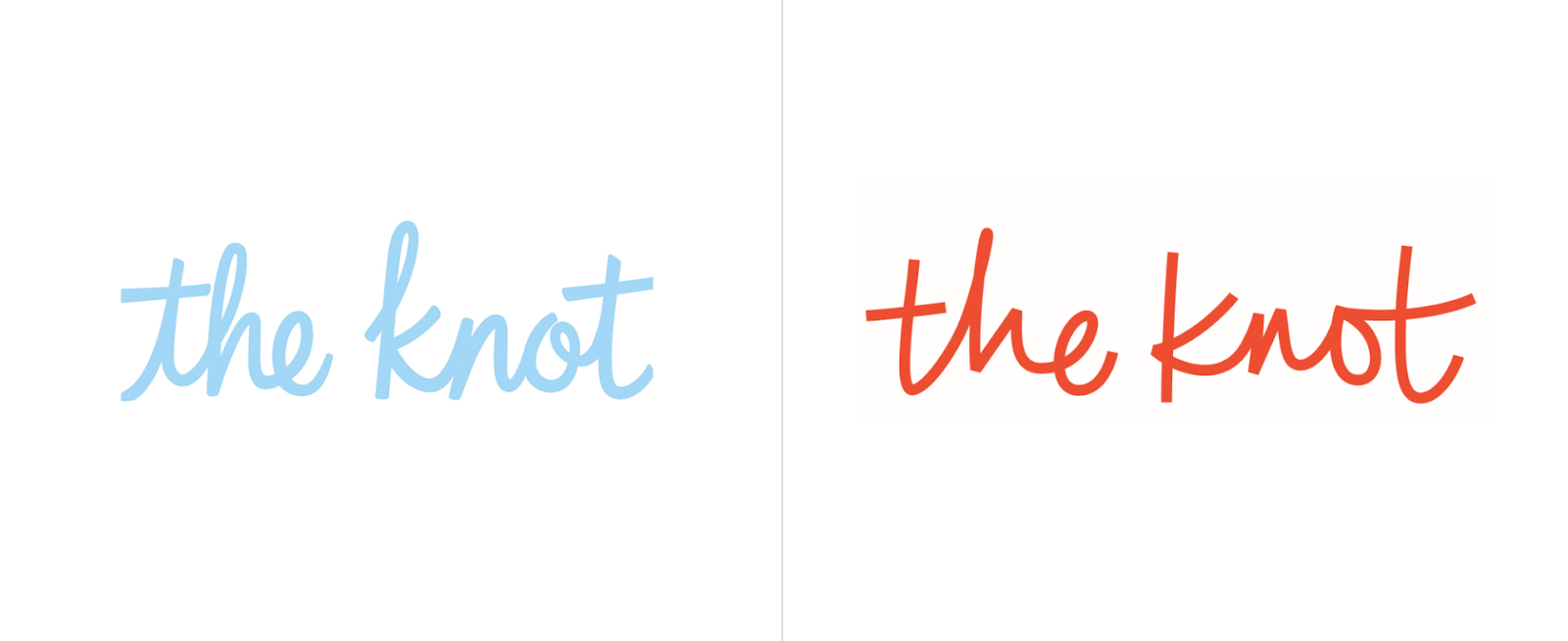
In these brand updates, elements of the old brand carry through. Zara kept its bold, black lettering, but pushed the kerning tighter and switched one Serif font for another. The Knot, on the other hand, stayed in the same typography family with a Script font, but swapped blue for orange in their color scheme.
Choosing Your New Color Palette
Color can have a huge impact on your brand -- in fact, some colors are now synonymous with the brands that use them, like McDonald's yellow. But choosing the right color can be difficult, and as your company develops, your color might need a brush up.
Looking at your brand colors with fresh eyes using color psychology and competitor research can help you evaluate whether they're working with (or against) the brand image you're looking to project.
Additionally, now that you've been working with your color(s) for a while, you may have noticed that the way your colors show up on-screen vs. in-print isn't consistent. When considering colors during your rebrand, check to ensure the color looks the same on a variety of brand materials.
Typography
Like your color, your original font may have shown up differently in practice than in theory. When you're reevaluating fonts, pay close attention to what worked and what didn't with your old font, along with any difficulties you had -- like accessing the font for web design or PowerPoints.
You might also want to consider whether your font is consistent with any markets or messages uncovered while rebranding. If your customers are more mature than you initially expected, that super hip Sans Serif font might be better off as a more traditional Serif font. After all, the medium is the message.
And now that you know your marketing channels, you'll be able to make more educated decisions on weight and cuts -- like which fonts show up well, and which leave your words looking wonky.
Shapes and Imagery Revisited
Like your logo, color palette, and typography, your imagery and shapes play a vital role in your brand identity. If you're changing any of your brand's other visual elements, it's worth reconsidering your imagery and shapes to keep everything cohesive after you've rebranded.
But it's not enough for your rebrand to look cohesive -- it needs to support the core messages of your brand, as well. At every step in the branding design process, make sure the what, how, and why behind your brand are also behind your new brand identity.
Building New Brand Guidelines
If you're going to go through all the trouble of creating a new brand identity for your business, you better make sure you use it correctly. Having (and actually using) brand guidelines will help you keep your brand consistent after the transition.
Brand guidelines are especially critical for logos. Logo guidelines are designed to make it as easy as possible for customers to see, recognize, and remember your logo -- making up for any lost familiarity that comes with a rebrand.
Here are a few elements to consider when writing your logo guidelines:
- Logo elements. What visual elements make up your logo? When and how are each of them used?
- Color variations. What does the colored version of your logo look like? What about black and white? When are each of these used?
- Clear space. Also called padding, this is the space around your logo that prevents overlap or obscuring. Aim for at least 10% of width at all times.
- Unacceptable uses. What can never be done to your logo? What color variations, rotations, scaling, etc. do you want to avoid?
You'll want to have your guidelines on hand if you're doing a website redesign, creating a rebrand campaign, or creating other marketing materials.
At its best, a rebrand can act as an incentive to remain consistent and on-brand in all your marketing efforts moving forward -- something that can slip in businesses over time.
Now that we've explored various aspects of rebranding, let's take a look at examples for further inspiration.
1. Chobani rebrand

In 2017, Chobani made a few major changes to their brand in an effort to stand-out in the crowded, oftentimes homogeneous-looking yogurt industry.
First, they shifted their identity from a yogurt company to a "food-focused wellness company" with a new mission -- "Fighting for happily ever after." Under their Impact page on their website, you'll see the statement, "The most important thing we make is a difference. It's always been about more than yogurt." You'll see this focus on health and nutrition in their advertisements and their new products, including Less Sugar Greek Yogurt and Chobani Flip Yogurt.
Additionally, as shown above, Chobani changed its packaging -- instead of using plain white cups with fruit photos, they redesigned their product packaging using 19th century American folk art with a variety of colors. Their rebrand helps their products stand-out from the other plain white yogurt packages on the shelves.
2. Candid rebrand

Rebranding is often a good decision after two companies merge.
For instance, Foundation Center was the largest source of information about philanthropy globally, and GuideStar was the largest source of information on U.S. nonprofit organizations. In 2019, the two organizations joined forces to become Candid, enabling both foundations to enhance the services they offer to millions of people who rely on them to help make the world a better place.
If you visit Foundation Center's website, you'll see a message that reads: "Foundation Center and GuideStar are now Candid. You were redirected to candid.org from foundationcenter.org." The old GuideStar website is still visible and usable, but there is an explanation of the new corporate entity and a link to Candid's page.
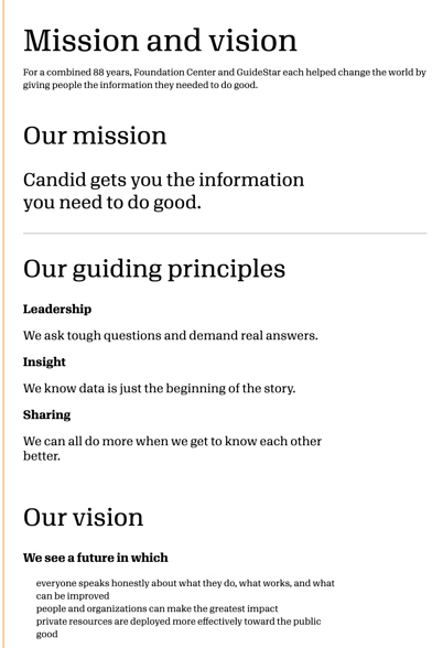
Candid, the new merged foundation, now boasts a sleek website with a mission statement, guiding principles, and a vision that combines the best of both Foundation Center and GuideStar.
3. Dropbox rebrand
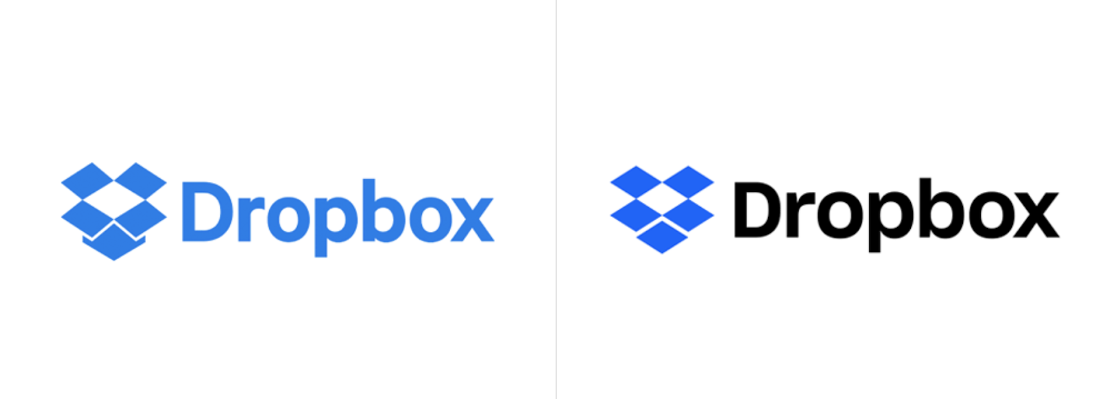
In 2007, Dropbox launched as a file-storage and file-sharing web service -- but in 2017, the company now wants you to think of them as " the connective tissue for teams and businesses of all sizes". Instead of just a file-sharing service, Dropbox is now a full suite with APIs, tools, and integrations.
Along with the internal mission shift, Dropbox refreshed its logo to reflect its new products. In a statement regarding the new logo, the Dropbox design team said, "Our old logo was a blue box that implied, 'Dropbox is a great place to store stuff.' The new one is cleaner and simpler. And we've evolved it from a literal box, to a collection of surfaces to show that Dropbox is an open platform, and a place for creation."
4. Pet Food Experts rebrand
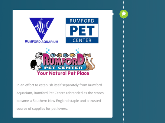
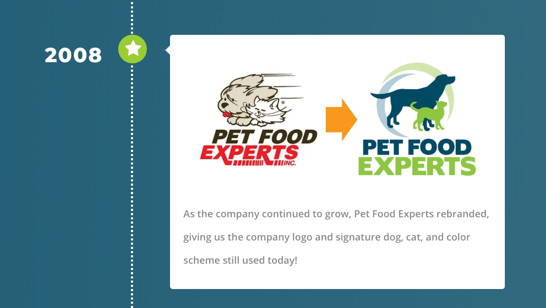
Pet Food Experts has a full timeline on their website that reflects all company changes since 1936, when the company first opened.
Among the most notable are the company's name change from "Rumford Pet Center" to "Pet Food Experts" (in an "effort to establish itself separately from the Rumford Aquarium"), and the logo redesign in 2008. The 80-year-old company has grown significantly over the years, and is now a major distributor of pet products from coast-to-coast.
To reflect their change and growth over the years, the company has taken numerous successful steps to consistently refresh their brand to reflect their products and values as they change over time.
5. Dunkin' Donuts rebrand

Beginning in January 2019, Dunkin' Donuts, first introduced in 1973, adopted a new logo that dropped the "Donuts" on their name -- now, signs, logos, and marketing materials simply read, "Dunkin'".
The new name signifies the companies focus on coffee -- Tony Weisman, Chief Marketing Officer, Dunkin' U.S., said in a statement, "By simplifying and modernizing our name, while still paying homage to our heritage, we have an opportunity to create an incredible new energy for Dunkin', both in and outside our stores."
Despite the change in name, Dunkin' continues to use the same pink and organic colors and iconic font to ensure long-time customers continue to recognize the brand.
6. IHOP rebrand
As you've likely gathered from this post, a rebrand is a fantastic opportunity to refresh your public perception and get consumers' attention.
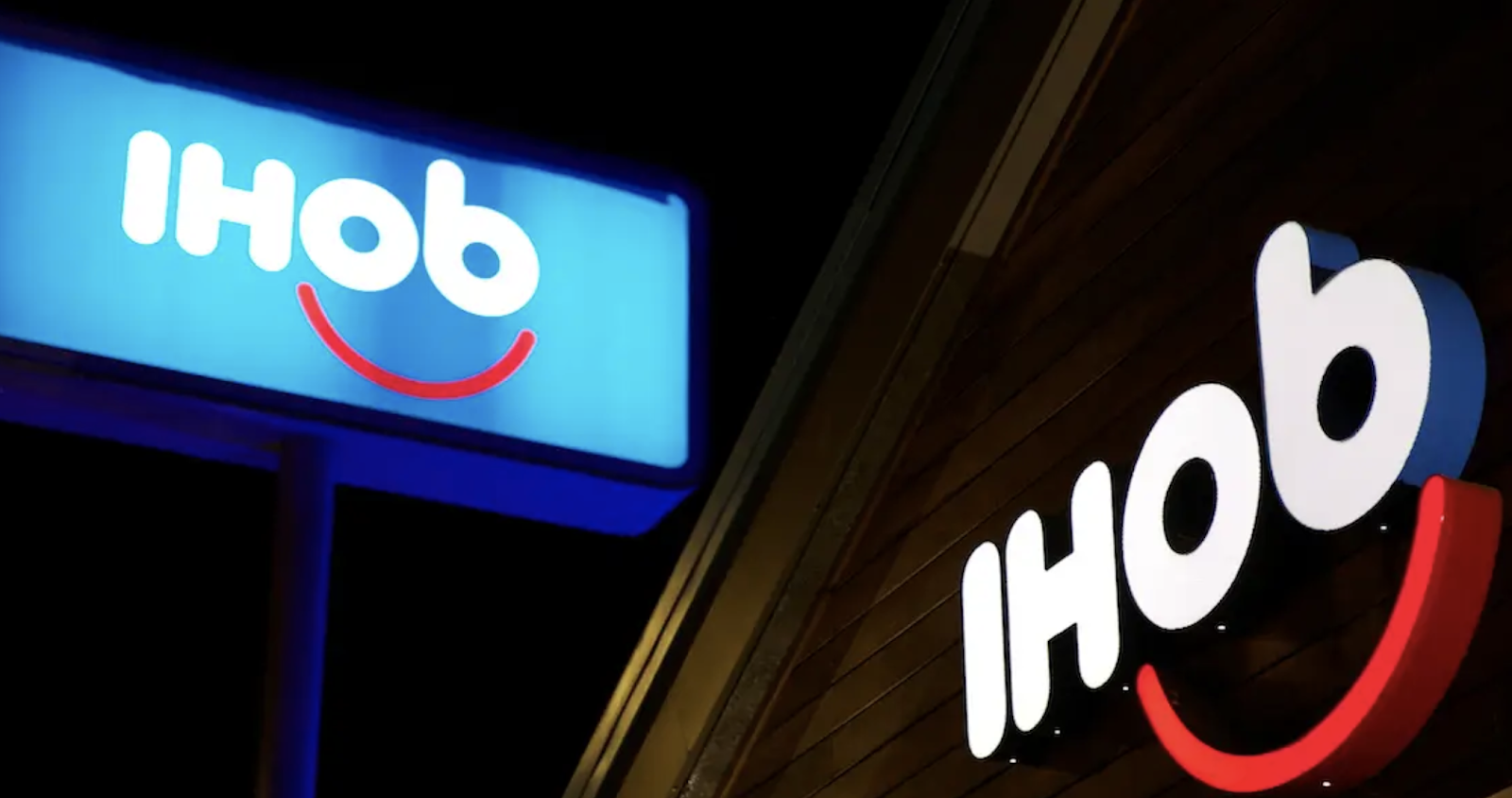
Which is exactly why IHOP used a rebrand as a marketing ploy to get people to pay attention to their new product -- burgers. In 2018, IHOP announced that it was rebranding as IHOb, the International House of Burgers. It began using IHOb on social media, its website, and in-store promotions.
Eventually, IHOP admitted its rebranding was a joke to get people to pay attention to their new line of ground Angus ground beef burgers. Their "joke rebrand" was a smart play -- it incentivized people to either vehemently fight for the importance of IHOP's most important product (pancakes), while also calling attention to their other offerings.
IHOP has since switched back to its original name and logo.
Are You Ready to Rebrand?
Now that you know everything a rebrand entails, it's time to consider if and how you want to rebrand your own business. Whether you end up going with a logo redesign, a website redesign, some refreshed messaging or a complete brand overhaul, these steps can help you to consider your best strategy for building a brand that gets it right this time.
No comments:
Post a Comment