Eight seconds — on average, that's the length of a human's attention span. This means that if you're a marketer, your content has to inspire, delight, and be seen as useful by your target audience ... in less than eight seconds.
Maybe social media-wise, your content is performing well. It's resonating with audiences and earning you engagement. But it's possible that when you look at website metrics, there's a different story being told.
If your session time is low and your bounce rate is high, you may be taking more than 12 seconds to attract a visitor's attention, which, for generating leads, isn't the best.
You may be losing traffic because the content website visitors see when they first visit your page isn't interesting enough to keep them there. Your landing pages might be compelling by the time browsers start scrolling, but if they aren't dazzling and user-friendly right off the bat, browsers can easily click away.
This means that your content above the fold could probably be re-done to engage visitors.
If your website has compelling above the fold content, you'll likely see higher conversion rates and lower bounce rates. If you're unsure, try to self-test by looking at your website from a new perspective — if you were a new viewer, would you stay on your site at first glance?
If your answer is "I'm not sure," don't worry, we're going to go over that, but first, let's discuss what it means for content to be above the fold.
What does above the fold mean?
Above the fold content is what webpage visitors see when they land on a website. Clearly conveying what an organization does and its associated benefits, above the fold content can inspire web browsers to explore the rest of the website and its offerings.
Content that's above the fold is what's going to pull the browser into your website. A webpage that's slow to load, is congested with information, and hard to use will probably not draw the reader in the same way a page with the opposite design would.
Let's talk about some ways to make sure your above the fold content stuns web browsers.
Above the Fold Website Design Best Practices
When you design your webpage, keep these practices in mind. They'll keep broswer attention and encourage them to explore the rest of your website.
1. Keep your design simple.
Above the fold content shouldn't be extremely busy — if it is, readers might not know where to look first and click away from the page. Alternatively, if they're not able to find the answer to their challenge quickly, they'll likely choose another website.
To keep your page looking professional, organized, and user-friendly, try adding one featured image or multimedia, such as a GIF or video, to your fold. Then, add a short headline that introduces your webpage, and a sentence below it that describes your page in more detail.
2. Make the content engaging.
Simple webpages are one way to keep a browser's attention. But when they get there, take opportunities to delight them. For example, when you write your headlines and body text, they should echo your brand voice.
You don't have to make huge changes to delight the browser. For example, if there's a CTA button on your page, instead of it reading, "Learn more," try "Ready to get started?".
If the featured photo on your webpage is static, see if you can deliver the same message with a GIF instead. Additionally, if all of your copy is one color, try adding one or two more — a good rule of thumb is to incorporate your brand colors for professionalism and consistency with the rest of your website.
3. Design your content for usability.
Above all else, your content should be easy to interact with. For instance, if you're working on the above the fold content for a product page. make sure your above the fold content is functioning as it should.
Let's say your product page's above the fold content is a video. Does it load correctly, include captions, and sound options?
Additionally, think about the experience of the user. If your above the fold content features a video that autoplays, will it interrupt the user's interaction with the page? To combat this issue, make sure the video plays on silent and includes subtitles, if needed.
4. Solve challenges for the reader.
Your content above the fold should answer the challenge of the browser. To illustrate, let's say you work for an email marketing service provider, and a browser searches "email marketing software" and lands on your homepage.
Your content, then, should include a few, if not all, of the keywords "automated email marketing software" in some form. For example, your headline could read "Email Automation for Marketers," and expand on that in the supporting text.
So, those are a few guidelines to keep in mind when designing your content. Next, we're going to look at examples of some websites with great content above the fold.
15 Compelling Above the Fold Content Examples to Inspire Your Own
1. Wistia
Wistia lets its users create dynamic videos for marketing campaigns. Their above the fold content introduces Wistia's services using a mix of multimedia: GIFs, videos, and short copy, to show off the capabilities of the service:
.gif)
The homepage video stops the browser in their tracks. They'll likely spend more time watching the talk-show inspired clip that explains Wistia's services. As a consumer, when I see real people on a webpage, it's inviting, and compels me to explore further.
A simple homepage like Wistia's feels casual. The welcoming atmosphere of the simplistic homepage conveys a professional vibe. And, after the video, browsers will have an idea of the software's offerings, straight from the expert marketers.
2. Velocity Partners
Velocity Partners, a B2B marketing agency, doesn’t have a company overview video for their above the fold content. Instead, the homepage has a fascinating interactive slideshow that explains why innovative marketers should leverage new content formats to tell more refreshing stories:.gif)
"Great marketing moves," describe what the business is all about, and is short, simple, and to the point, letting the slideshow do the heavy lifting when it comes to attracting visitors. Velocity Partners' above the fold messaging sparks curiosity, and in turn, the incentive to keep scrolling.
It's important to note, however, that if you want to use above the fold content similar to Velocity Partners, make sure the first few seconds of your slideshow, as well as your copy, are the most engaging. If they aren't, the browser probably won't feel inclined to stay on the site past reading the headline.
3. VeryGoodCopy
VeryGoodCopy is a creative agency that crafts articles, landing pages, web pages, and emails for brands. Above the fold, the website lets the copy describe what the company can provide for users: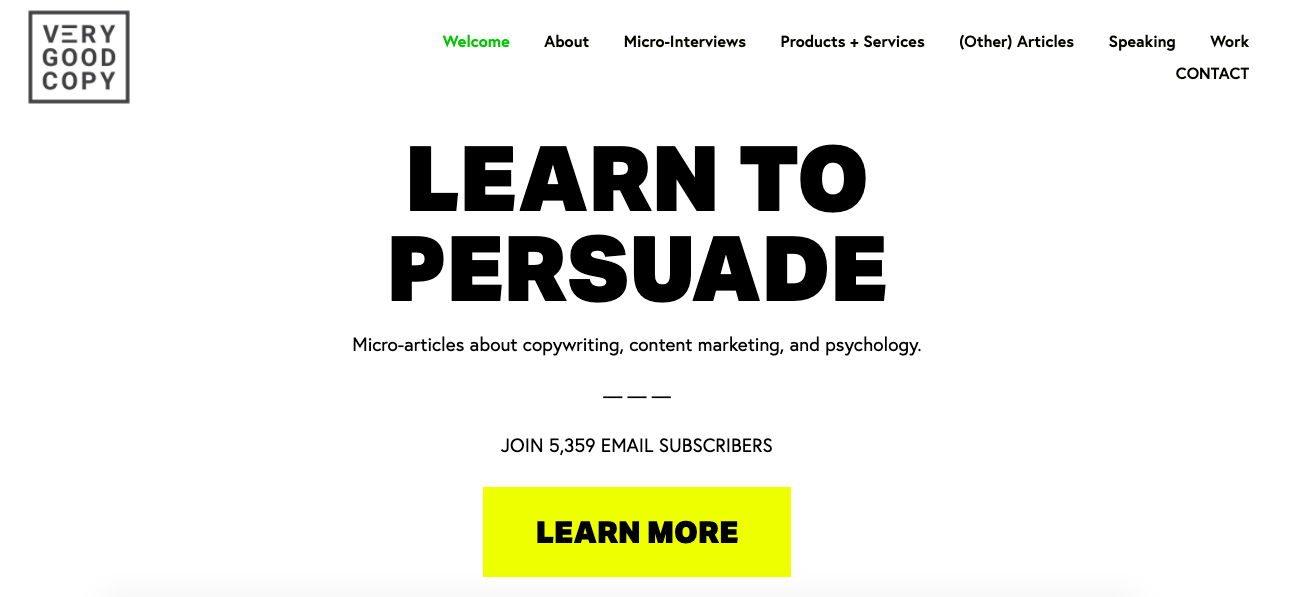
The headline conveys the opportunity for marketers to learn how to persuade by leveraging ample white space, an enticing headline, a brief description of their content topics, social proof, and a vivid call-to-action. This simple and engaging above the fold design ensnares their visitors’ attention and convinces them to check out their micro-articles.
4. Shopify
Images are how the above the fold content on Shopify's website invite the reader to explore. Shopify allows entrepreneurs to begin their own ecommerce business, relying on them, rather than copy, to explain features of the software:
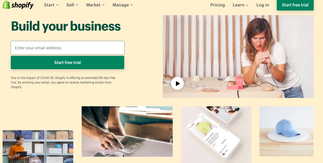
The homepage includes artistic images and an alluring video to make a lasting impression on the browser. And, even though copy is sparse, the tagline is packed with purpose and compels visitors to click that green CTA to start a trial.
5. Ann Handley
This Wall Street Journal best-selling author and partner at MarketingProfs, Ann Handley, used the homepage on her website to impress browsers by highlighting marketing prowess. Hyperlinking and linking are heroes here — linking to other pages on a website can earn more clicks on various pages on a site, like Handley's headlines:
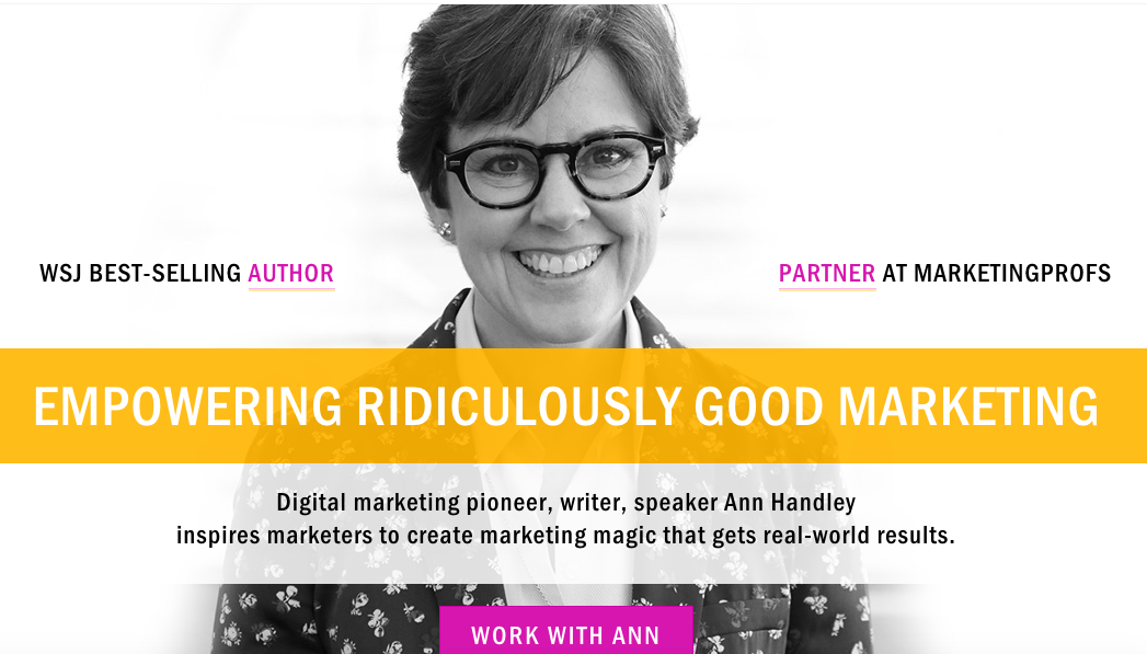
She also leverages white space, a welcoming picture of herself, a catchy tagline, compelling copy, and a vibrant call-to-action to persuade her visitors to consider working with her. From this homepage, the visitor knows what Handley looks like, what she has done and how to contact her. As far as above the fold content goes, it's a home run.
6. Mint
Above the fold content can maximize on simplicity, like it does for Mint, a budget tacking & planning software. The simple, yet professional, homepage effectively conveys the company and how they can help customers.
Notice the copy in the headline — it emotionally connects to reader in two sentences, opening the door for them to explore the website of a company that knows them:
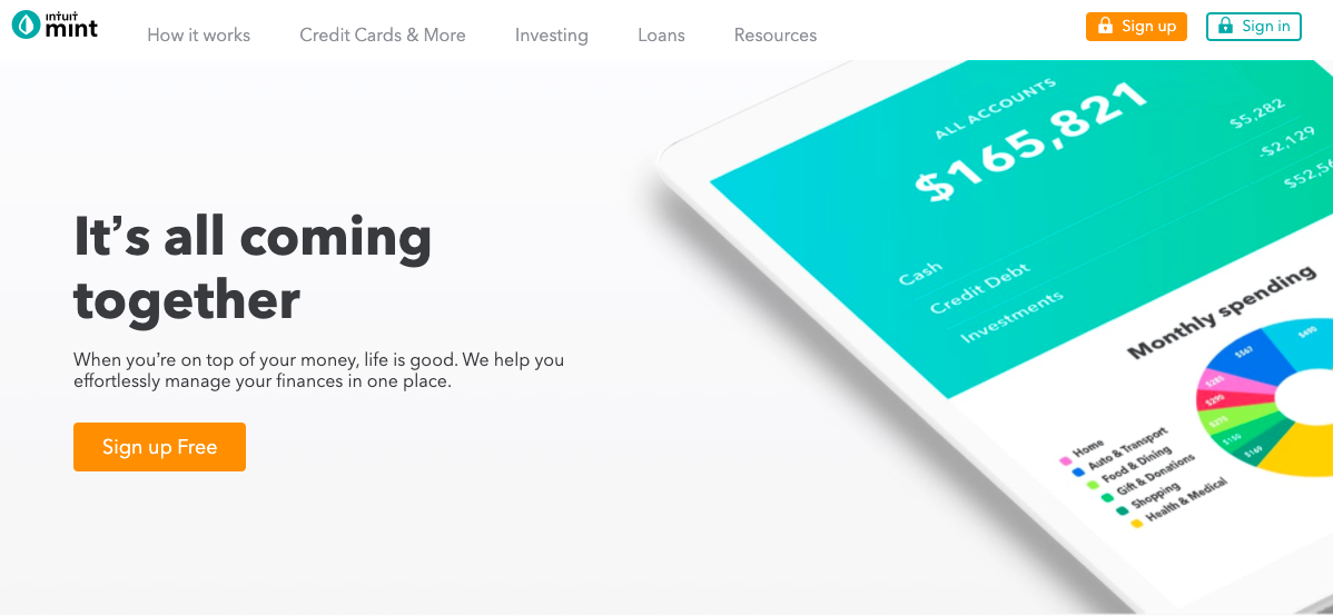
Mint also has a photo of their app in action to catch their website visitors’ attention. This helps the browser visualize how the app will look if they decide to sign up.
7. InVision
How do you show customer stories dynamically above the fold? Let's take a look at InVision's sleek example: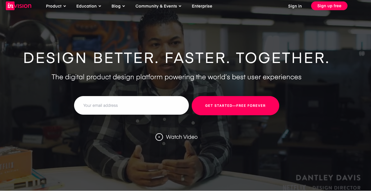
InVision is a digital product design company that helps users easily build sleek impressive websites, so the design team at the company knew the homepage had to impress visitors. It does, auto playing a silent version of the company's overview video, complete with testimonials from decision-makers at companies such as Uber and Twitter.
The copy that's layered above the video does a great job of concisely explaining what the company does for users, and the "Free Forever" CTA even entices me, a marketer who isn't looking to design a website, to get started learning more about the software offerings. It also doesn't hide the titles of those decision makers from the video — "Dantley Davis, Netflix Design Director" is a large enough lower third that can catch users' eyes when they aren't looking (Mine definitely were caught).
8. Animalz
Similar to VeryGoodCopy, Animalz is a content marketing agency whose website doesn’t bombard visitors with messaging about their services in the above the fold design. Instead, visitors are greeted with the headline, "The world's best content marketing happens here," which entices a marketer like me to read further to learn how: 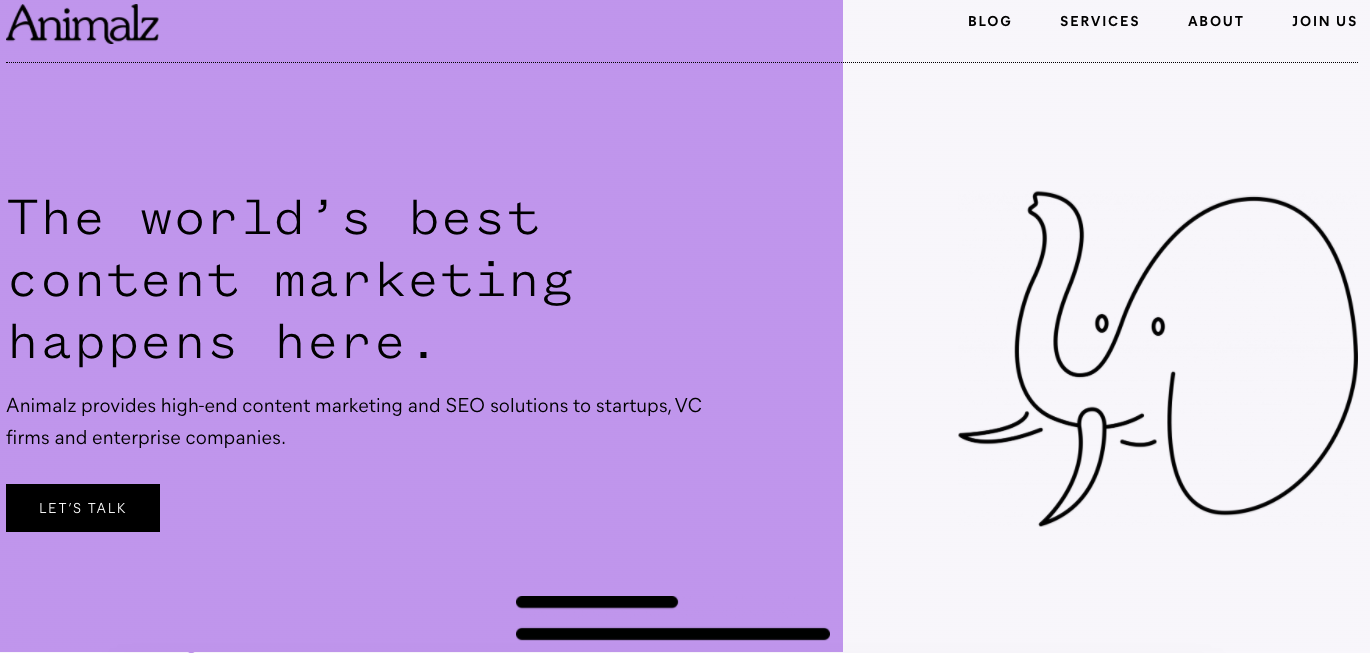
The CTA copy is different from run-of-the-mill CTA buttons. "Let's talk," rather than, "Click here to learn more!", implies that when visitors click on the CTA, they will be taken to a real person who can offer them more information about the service.
The website also leverages white space, and uses simple, hand-drawn images to entice the reader to scroll down. The purple squiggle runs down the webpage to introduce Animalz's top customers, and leads to a form to get in touch with the company.
9. Ahrefs
Maybe you work for a company that wants a no-nonsense homepage, that conveys the bells and whistles of the product without congesting page with an overload of information. If that description fits you, take a look at Ahref's above the fold approach: 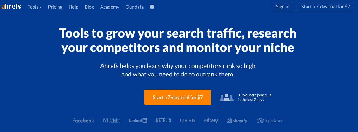
The headline of the webpage describes what the service does: helps users improve their SEO. This is further supported by the smaller headline, and CTA communicates to browsers pricing information.
Satisfied customers are listed at the bottom, right before the fold, to give a rounded-out overview of how Ahrefs can be a benefit to successful companies. If you want your homepage to use more copy, rather than visuals, try presenting it in a simple way that doesn't use more than 30 words, like Ahrefs did.
10. Twitch
After typing in Twitch.tv into your browser, you're immediately immersed into what the website offers: live streams for gamers. This is because as soon as your browser accesses the website, a featured live stream begins autoplaying:
.gif)
While it can be a bit jarring to suddenly hear voices coming from your browser, Twitch's above the fold design doesn't use any copy to describe their services. Instead, users can jump right in and demo the content themselves, browsing streams without having to make an account or read anything. They can keep scrolling to see popular streams, click one, and explore the site's capabilities from there.
Because of how the site works altogether, this above the fold approach works. Twitch offers visitors to trial their services without doing any reading. Visual platforms similar to Twitch can benefit from this method, pulling in visual learners and non-visual learners alike.
11. Skillshare
Skillshare uses video to explain the bulk of their services above the fold. Because the software offers online classes in a variety of subjects, the video displays an overview of what Skillshare can help you accomplish, learn, and feel:
.gif)
The video highlights confident-looking adults diving into their passions, which is what Skillshare helps users with. The layering text inspires visitors to explore their creativity with the software — and get started for free.
12. Flock
If you know that your company's website will benefit from a media mix of content above the fold, consider approaching that like messaging app Flock does. The key to using a mix of content on a homepage is to design it so the information doesn't interrupt the experience of a first-time visitor to your website:
-1.gif)
Notice how the gifs are used to highlight the changing text that displays the app's features. The supporting hand-drawn image illustrates how Flock works, and the CTA text displays a little personality. Using a mix of media to spice up your homepage can be as simple as one moving image, a clickable button, and a drawing to display an overview of your company to visitors.
13. King Arthur Flour
The above the fold content of this Boston-based baking ingredient supplier, King Arthur Flour, is top notch. It gives visitors the choice to watch a video tutorial on how to make sourdough bread using the company's offerings:
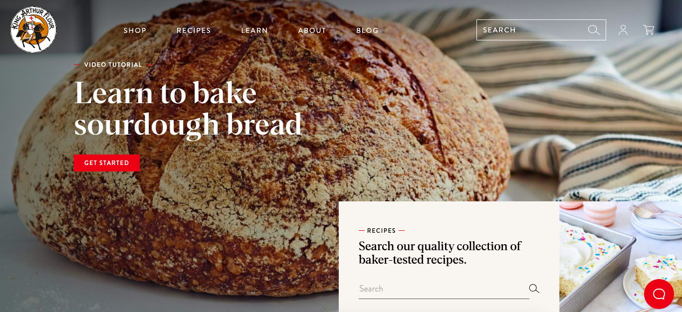
I could get a feel for the company's offerings: a Facebook Page (which houses the business' baking show), recipes, a baking FAQ, products for purchase, and even a "Baker's Hotline", which works as a Contact Us page.
The slideshow features, equipped with a glossy photo and their own CTA, gave me a complete overview of everything the company can do for aspiring bakers. It goes outside of just the business's products, and instead, offers helpful information for bakers in general, which is welcoming to someone who may be intimidated about bread baking.
14. Clarkisha Kent
Are you a freelancer wondering how to make your above the fold content stand out among your competition? If so, when you design your homepage, make sure it accomplishes two things: displaying personality, and easy navigation.
This is because, while your work has to precede you, so does your personality, especially as a freelancer. If you're a writer, like Clarkisha Kent, your copy has to sell it, like her website does: 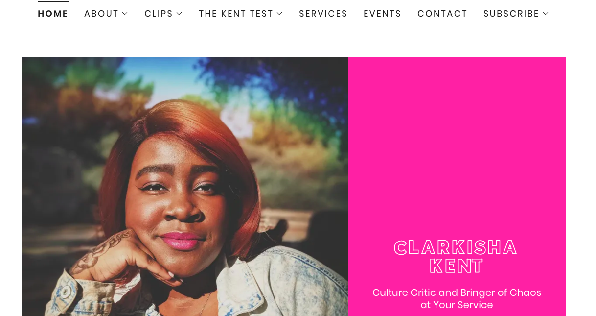
The inclusion of a headshot and interesting headline quickly displays more of who Kent is as a writer, and the angle she is likely to take as a contributor to websites. Her navigation bar includes links to viral tweets she's made and clippings from other publications, so her homepage doesn't have to.
Instead, her homepage serves as an introduction, which can precede her before the rest of her website. When browsers are drawn in by a minimalistic webpage with cliffhanger text, they're likely going to be interested in exploring the website to fill in that gap. For instance, when I read, "Chaos bringer," I instantly wanted to know how, which prompted me to look at her past work.
15. Good Witch Kitchen
This is another example of how to convey the personality of your brand if you're a freelancer or small business owner. Good Witch Kitchen is the name of holistic nutritionist, Kristen Ciccolini's, business. Right below the fold is a quick slideshow of publications that have featured Ciccolini's work, before diving into an introduction:
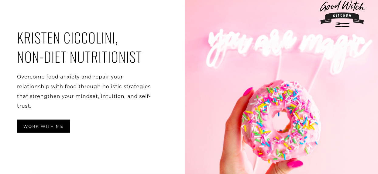
Ciccolini's logo, a bright image related to her craft, and copy accurately provide a quick view of the atmosphere Good Witch Kitchen conveys: A non-diet approach to nutrition management from an expert.
Now that you have some inspiration about how to keep your customers engaged on your landing pages, which strategy are you going to use for yours? I can't wait to see what you come up with.
No comments:
Post a Comment